- Max Magazine Ads 1 - Images
- The Brief
- The Execution
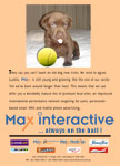
The first ad was originally a concept I had thought of while brainstorming ideas for the Max Silhouette Posters and discarded at the time.
Subsequently the MD of Max Interactive tasked me with creating some print advertisements to run in the B&T and Digital Media World industry magazines to help raise the profile of our company, so I came up with the original ad copy to go with the image I'd created earlier, and with the director's blessing we ran the first ad in a number of consecutive issues.
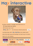
We received a fair number of positive comments and business enquries based on the initial runs from both clients and suppliers, so the second ad was subsequently generated and ran later to once again reinforce the Max brand, and to act as a 'teaser' campaign for a (then) upcoming product launch.
The first ad (puppy with ball) was based on a number of concepts; wanting to emphasise the strength of the Max brand and the reliability of our service whilst trying to retain a 'playful' and light-hearted side to the advertisement, wanting to run something a bit 'different' from the standard 'conservative' ads which (surprisingly) often feature in those publications, trying to reference yet concurrently subvert an iconic early 90's music video image a lot of advertising executives in their thirties and forties may be familiar with (i.e. the chocolate coloured labrador featured extensively in the video for New Order's "Blue Monday"), and wanting to position the MD's recently accquired puppy (the dog photographed for the ads) as an unofficial 'mascot' for Max. The source photos required only minor manipulation in Photoshop for this first ad.
The second ad (puppy with phone) was a follow up to the first and ran a few months later to once again reinforce awareness of Max within the industry, and also to act as a 'teaser' for the up-coming launch of of Max Interactive's new Max Mobile product. This time the original source photos had to be more drastically manipulated, to retain a visual 'link' to the original ad, whilst allowing the puppy to 'hold' a mobile phone - something obviously not possible in real life.
In both cases various branding logos (in-house and sites represented) were added, the final ads were converted to print-ready PDF's (oversized / mini-broadsheet size) and sent to the magazine publishers, who ran them in the magazines printed on glossy full colour print stock.

